
Peonies, especially tree peonies, are exquisite flowers in the garden, in a vase, and as painting subjects. Their large cup-shaped petals surrounding long anthers and filaments create interesting three-dimensional forms that, with color, value, and line elements, frequently inspire new paintings. It’s no wonder many artists have depicted these flowers for ages.
Above is simply a first wash of yellow on the anthers. The drawing outlines only the main shapes. Note the two ants on the paper at left – ants love peonies and these two seem to show interest in the newest!
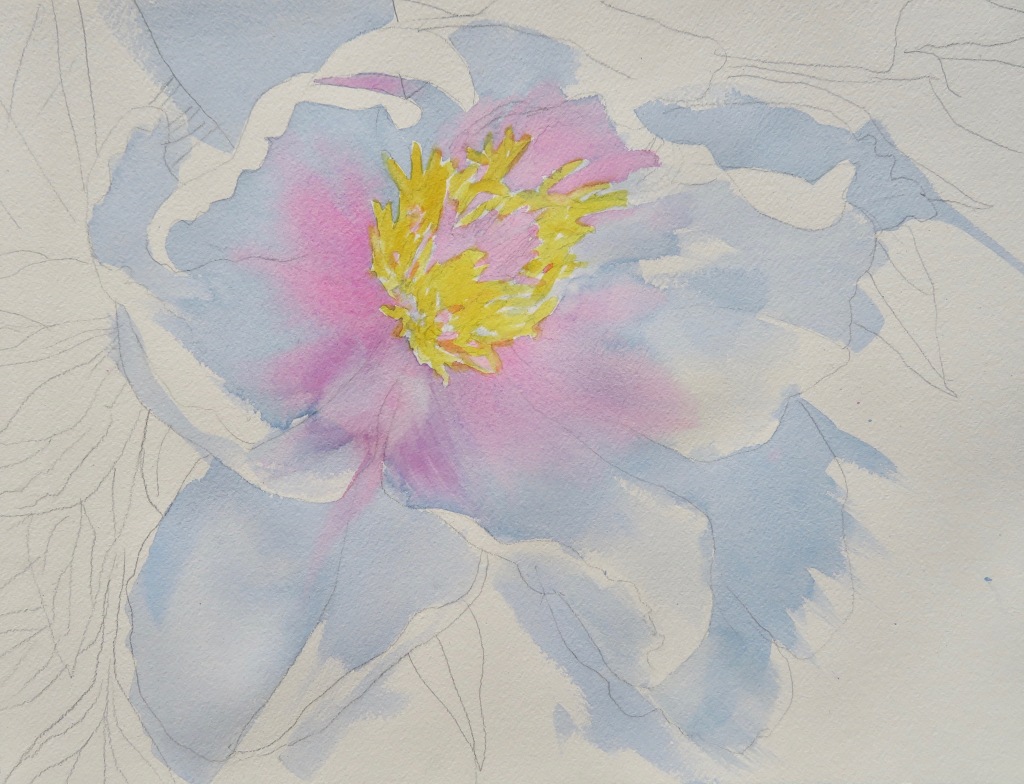
Yellow shapes are painted first and allowed to dry because the next wash (above) represents the shadows and color behind them. The latter is painted quickly and loosely on partially wet paper, and on dry where shapes need definition. While blue is still wet, pink is added, dry-on-wet. Color overlaps some yellow shapes a bit. This often happens when painting defined adjacent shapes in primary or opposite colors on dry paper. Note that blue otherwise overlaps many lines, yet white shapes around the flower purposely prevail.

Colors remain very bright, though they won’t all end up that way. Vivid green, the first wash of background leaves, is brought to the flower’s petal edges but otherwise the foliage has no particular definition yet. As the paint dries, a few veins are scraped in. A second wash of blue in a tea- to coffee-consistency, like the first, begins to suggest sculpted petal forms.
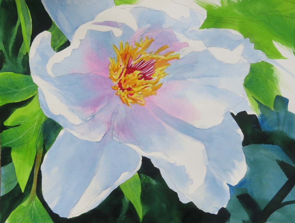
The background foliage and stem shapes were largely added intuitively as I tried to plan a cohesive arrangement to best emphasize the flower and its delicate center. Yellow-greens are diagonally balanced and contrasted with blue-greens. However, now the rich darks make the petal shadows appear too weak, so another layer or more of value is necessary on them.
It’s getting there… but many greens are still too bright. More (slightly dirty) blue in strategic places both tones them down and suggests depth among the leaves, much easier than trying to brighten dull, grayed and dark washes applied too early! Some foliage/stem shapes are punctuated with very saturated darks.

Here’s a more complicated peony painting finished almost in conjunction with the above:

The first stages were painted similarly to A Simple Peony. Here there is more nuance to the petal shadows, some ill-defined and soft-edged, others clearly indicating folds and separate petals, and anther forms being cast onto them. Layers from palest to darkest – probably ten in all – on dry paper and with pink here and there achieve these value nuances.
The background, meanwhile, is a range of warm and cool, bright and light greens painted very quickly and wet-on-dry right up to the flower’s petals. Some saturated dark forms begin to define particular shapes and a few leaf veins are scraped in.

The left side of this painting was left largely to intuition. I began (as always) with relatively pale, loose washes. The two dark stems at left lower center and other high-contrast shapes make the background too busy with no real area for the eye to rest. More dark background will add impact to the largest white flower petal.

Better, but needs more umph! Cobalt with carefully placed super saturated dark green shapes provide the perfect foil to the brightly lit, dramatic flower…


This is wonderful to see!! Recall the examples of your paintings
you brought for us to review at your Peabody class a few yrs. ago – including this beautiful peony!
LikeLiked by 1 person
Was actually last year, though it sure feels like more time has passed since then! And yes, the second is indeed the peony I had begun at the Yale Peabody class but didn’t have time to complete until now. You have a great memory!
LikeLiked by 1 person
A stunning example of the exceptional gift that Bivenne has in her use of light and dark. Her backgrounds are incredible and they give light to the centerpiece, the peony. So excited to follow her phenomenal talent, and to learn just a 10th of her talent. What an amazing artist!! Insanely extraordinarily beautiful!!
LikeLiked by 1 person
Thanks so much, Chris 🙂 Made my day
LikeLike